Captain Bill Kelly and the Golden Cocks hockey team needed modernized jerseys to outfit their growing lineup, while using their 2010 jersey as the inspiration for the designs. They wanted two separate kits; a home jersey featuring a primary color of clean white, and an alternate jersey with their strong, fierce gold as the primary.
The Primary LOGO & Jersey
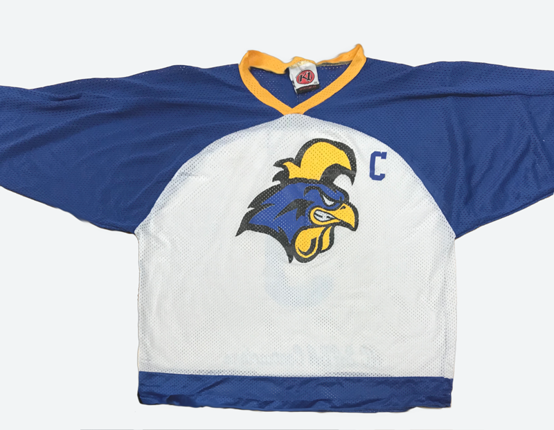
2010 jersey - used for inspiration
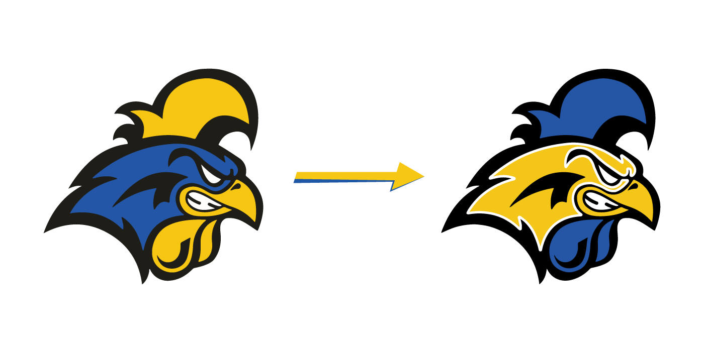
Revisions to old logo
To keep the team true to their design roots, the gold and azure blue from their former jersey was sampled and incorporated into both the primary and alternate jerseys, creating a cohesive and consistent color palette amongst the brand.
Listening to the client's ideas and vision prompted an alteration to color layout on the logo, reversing the gold for the blue areas while retaining a gold beak for authenticity. A white stroke was also added to the interior of the rooster's face to add electricity, vigor, and intimidation to the mark.
With the white backdrop predetermined and a clear color palette established, the jersey creation process began. First, the jersey was framed with a strong 5-part bottom stripe consisting of 2 blue outer stripes and one center gold stripe, separated by thin white stripes, and player numbers were added to both sleeves, with the left sleeve reserved for the C/A designation.
The numbers were created using Arvo italicized with double strokes of white and gold, with the center color being the same high-contast azure blue in the rest of the jersey.
My suggestion of adding wings was accepted and the final proof, as seen below, was sent to production:
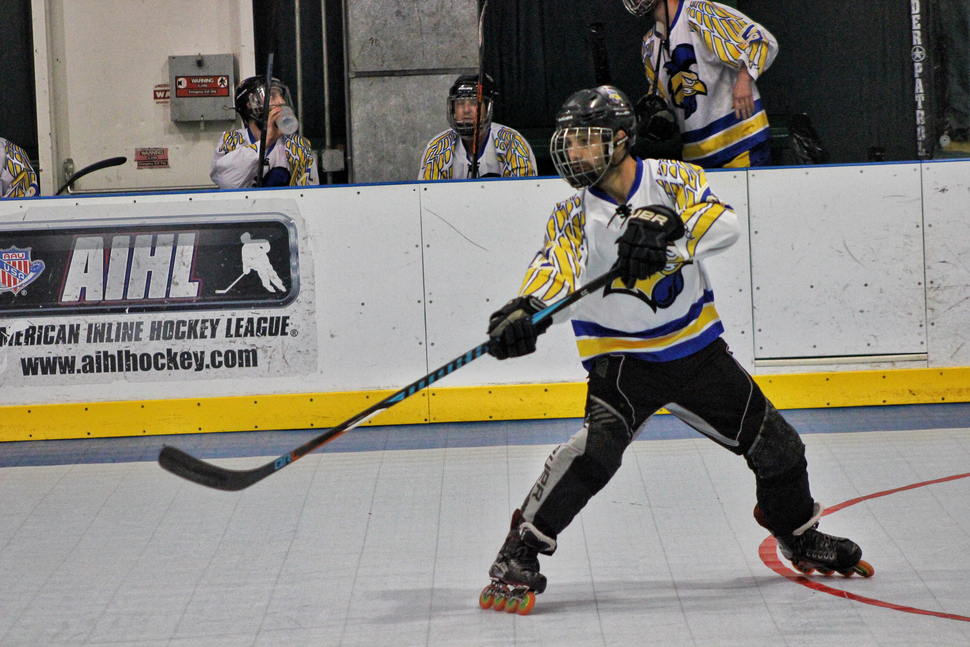
Jerseys in-game
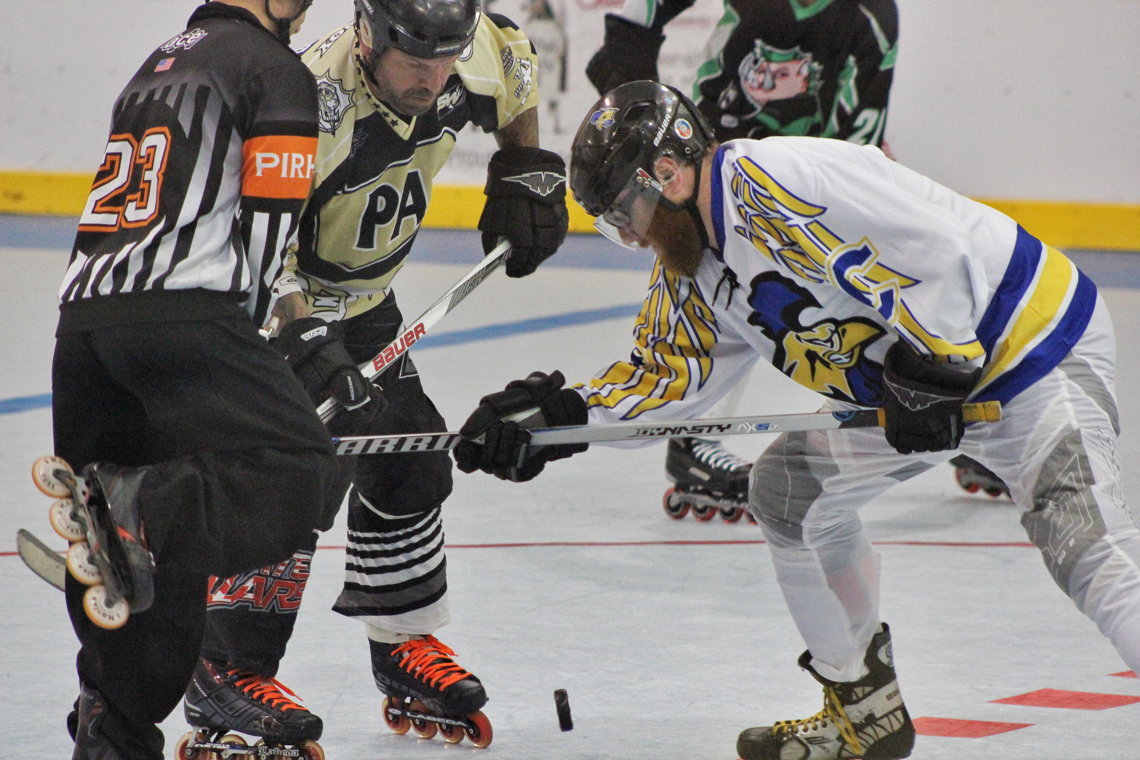
Jerseys in-game
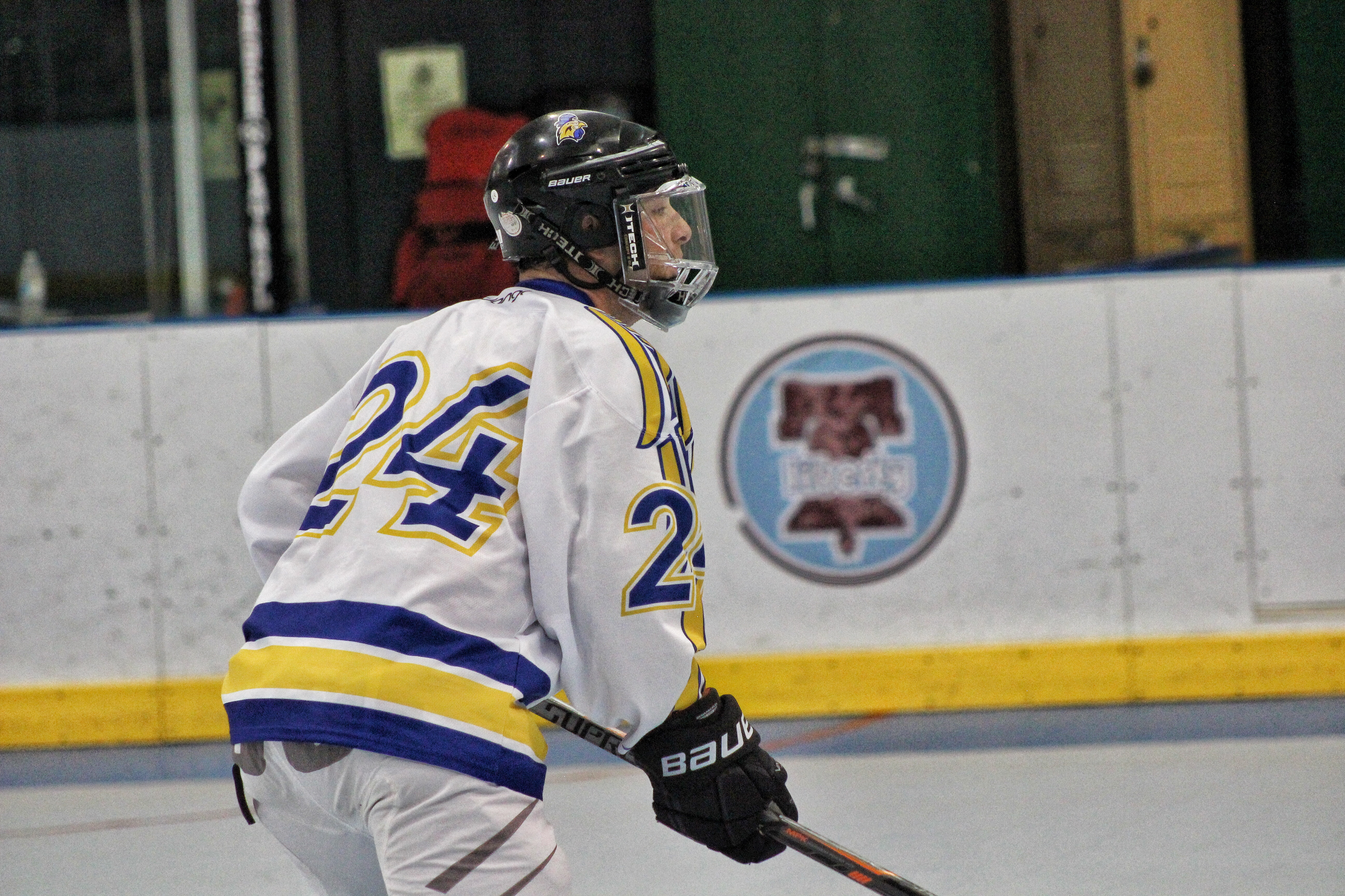
Jerseys in-game
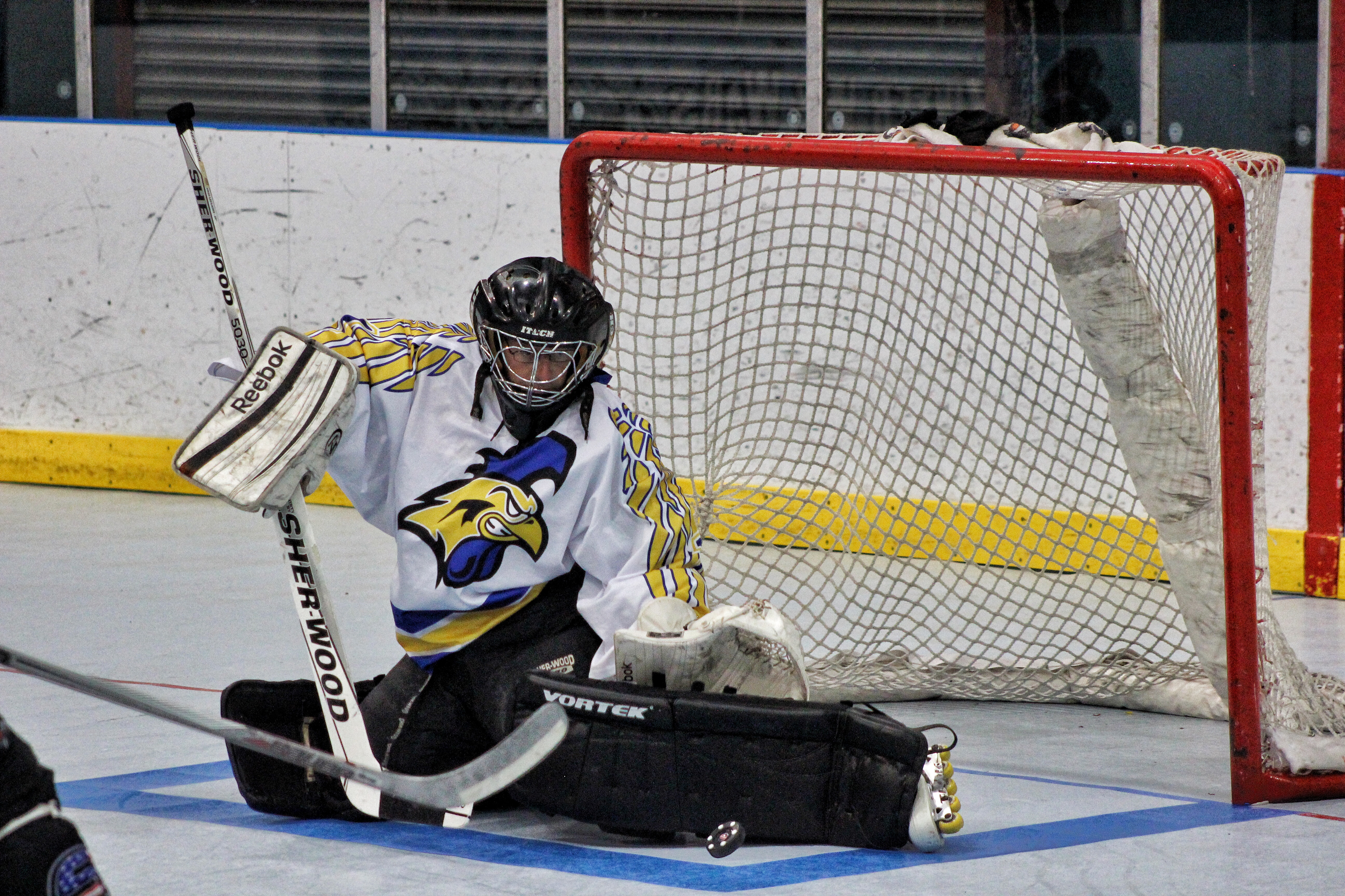
Jerseys in-game
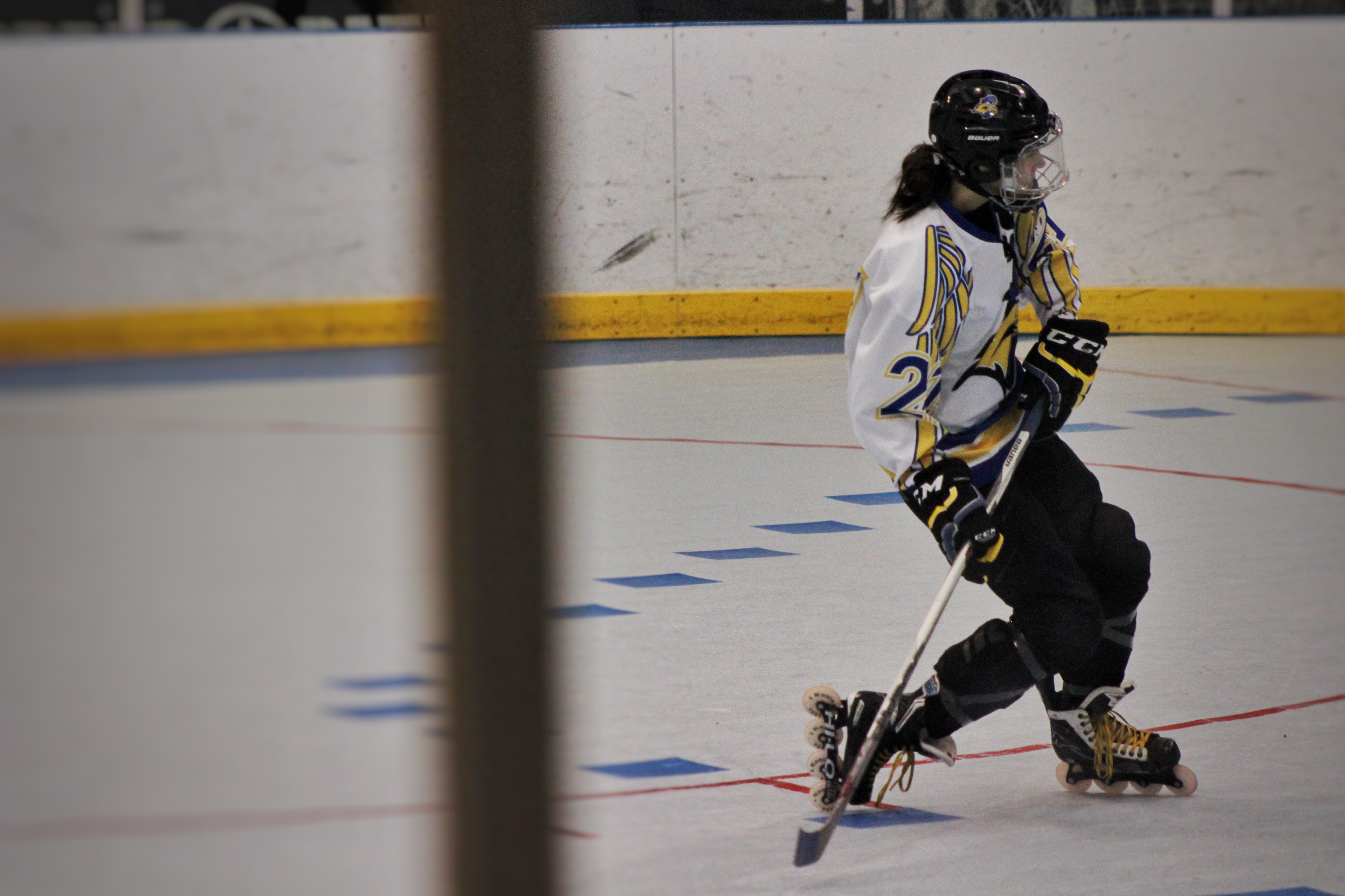
Jerseys in-game
The Alternate Logo & Jersey
The team's alternate jersey was inspired by the 1976-1982 Colorado Rockies, similarly incorporating a third color of fire engine red. This kit was created to offer the team a contrast to their primary white jersey, ensuring all players, referees, and fans knew how to identify a GC player. The team opted for a personalized logo mimicking that of the Sydney Roosters rugby team:
The initial concept for the alternative jersey incorporated left sleeve numbering above the stripe while the right sleeve featured the team's throwback primary logo, and the C/A insignia was placed inside the striping for the final production version.
Drawing inspiration from stock car racing numbers for their inherent energy, subconscious indication of speed, and easy-to-read format, the number styling was created using Commando, an inherently italicized font. The numbers were filled with the team's blue, and featured triple strokes, separating the blue and red strokes with a white stroke to coordinate with the white in the logos.
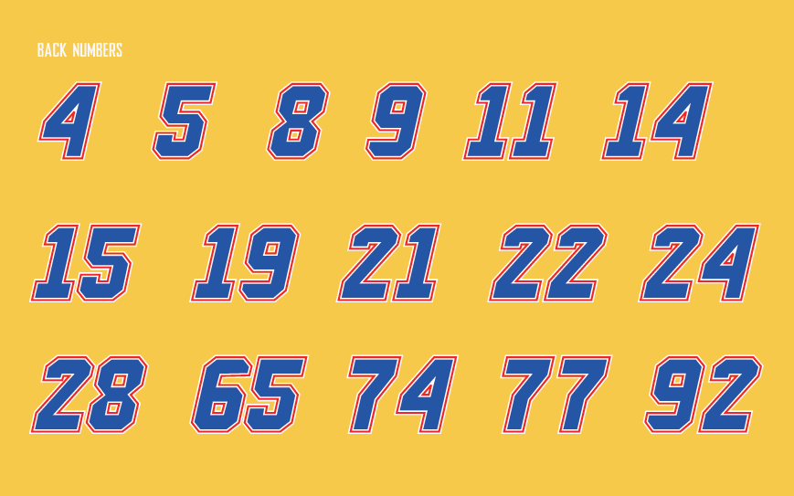
Player numbers
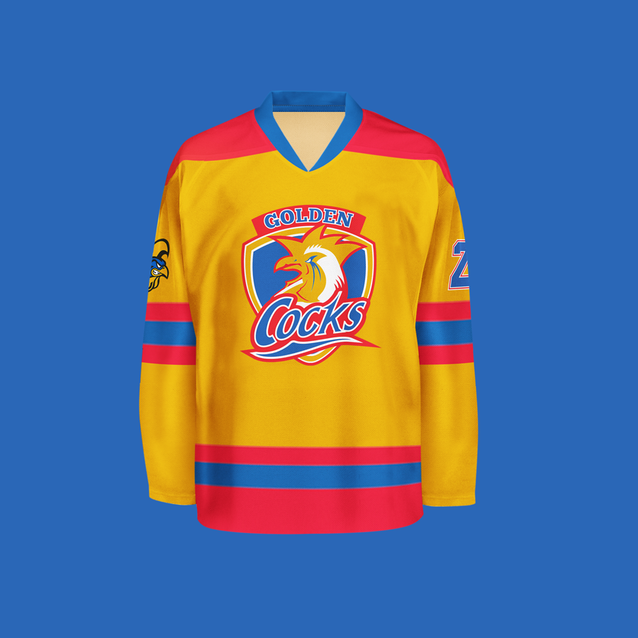
Final printed jersey

Final printed jersey
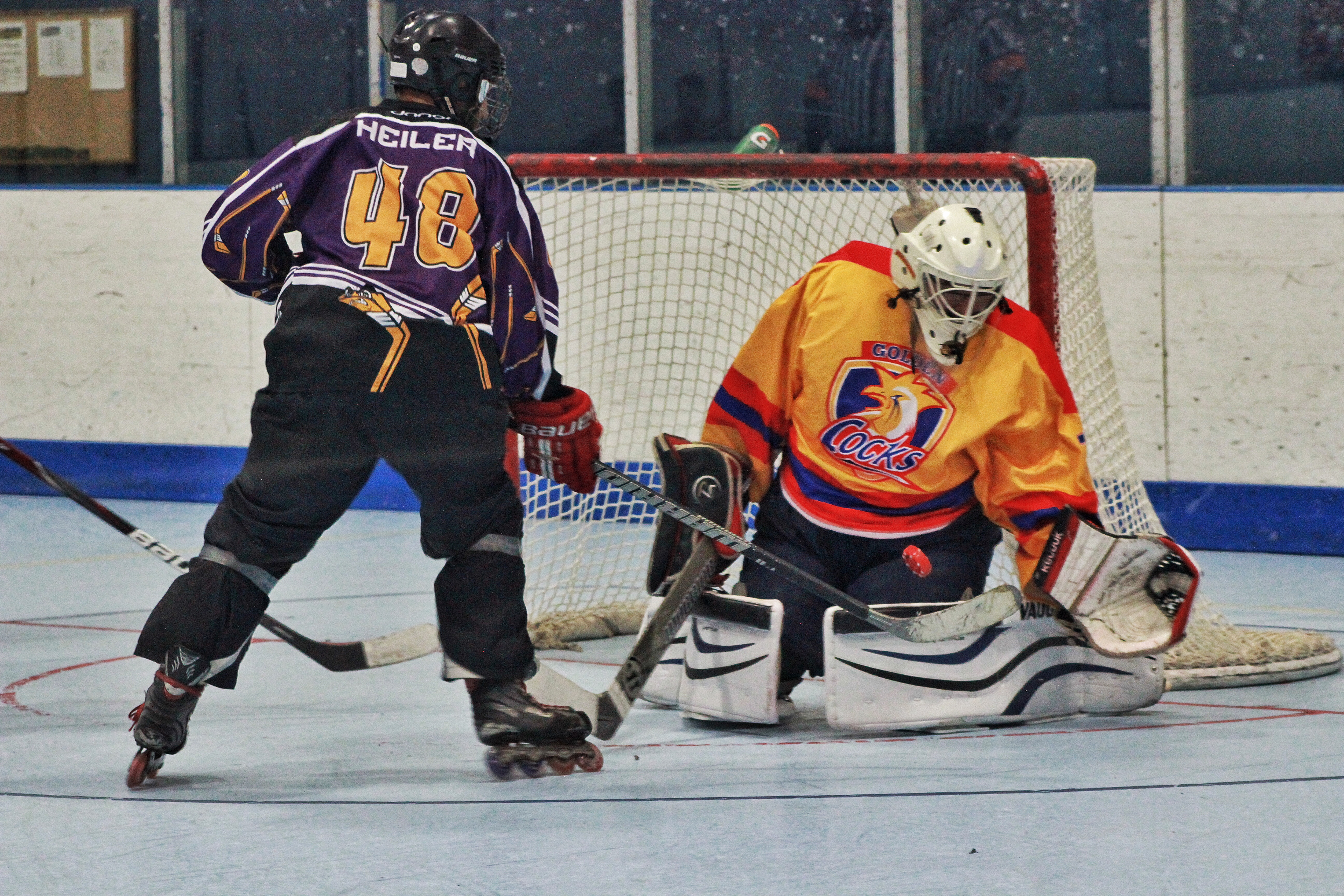
Jerseys in-game
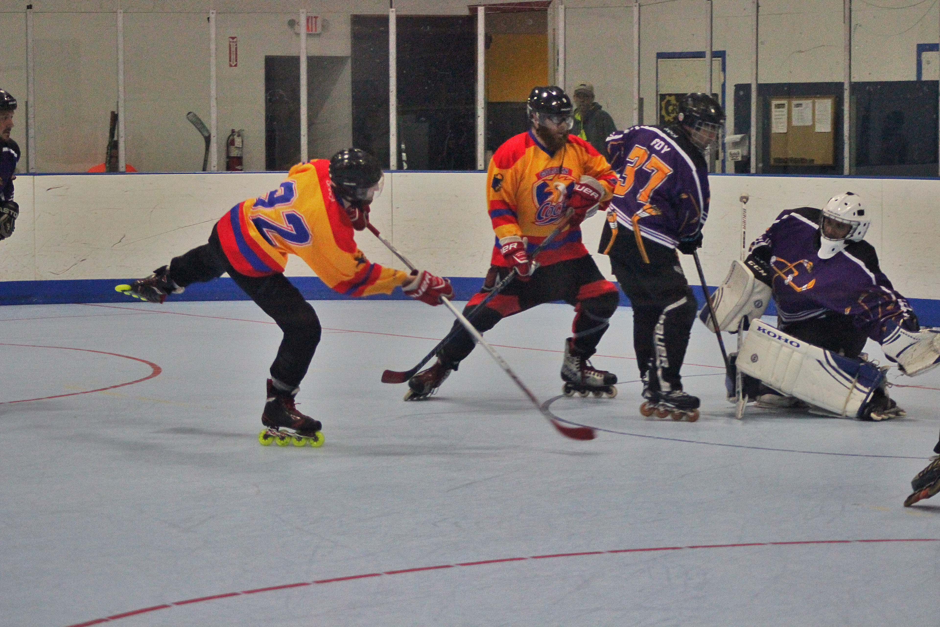
Jerseys in-game
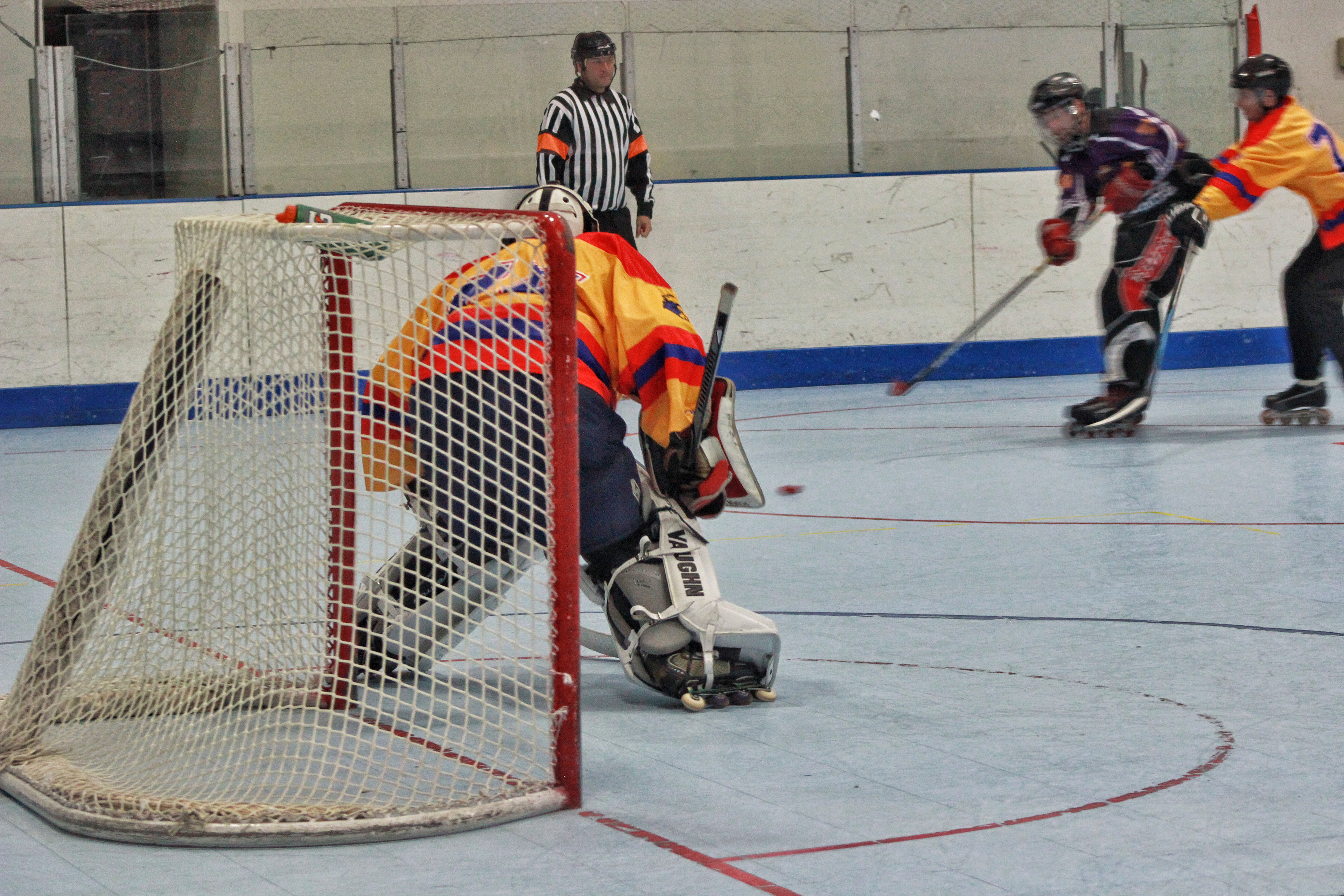
Jerseys in-game
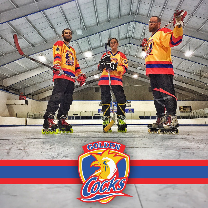
Jerseys in-game
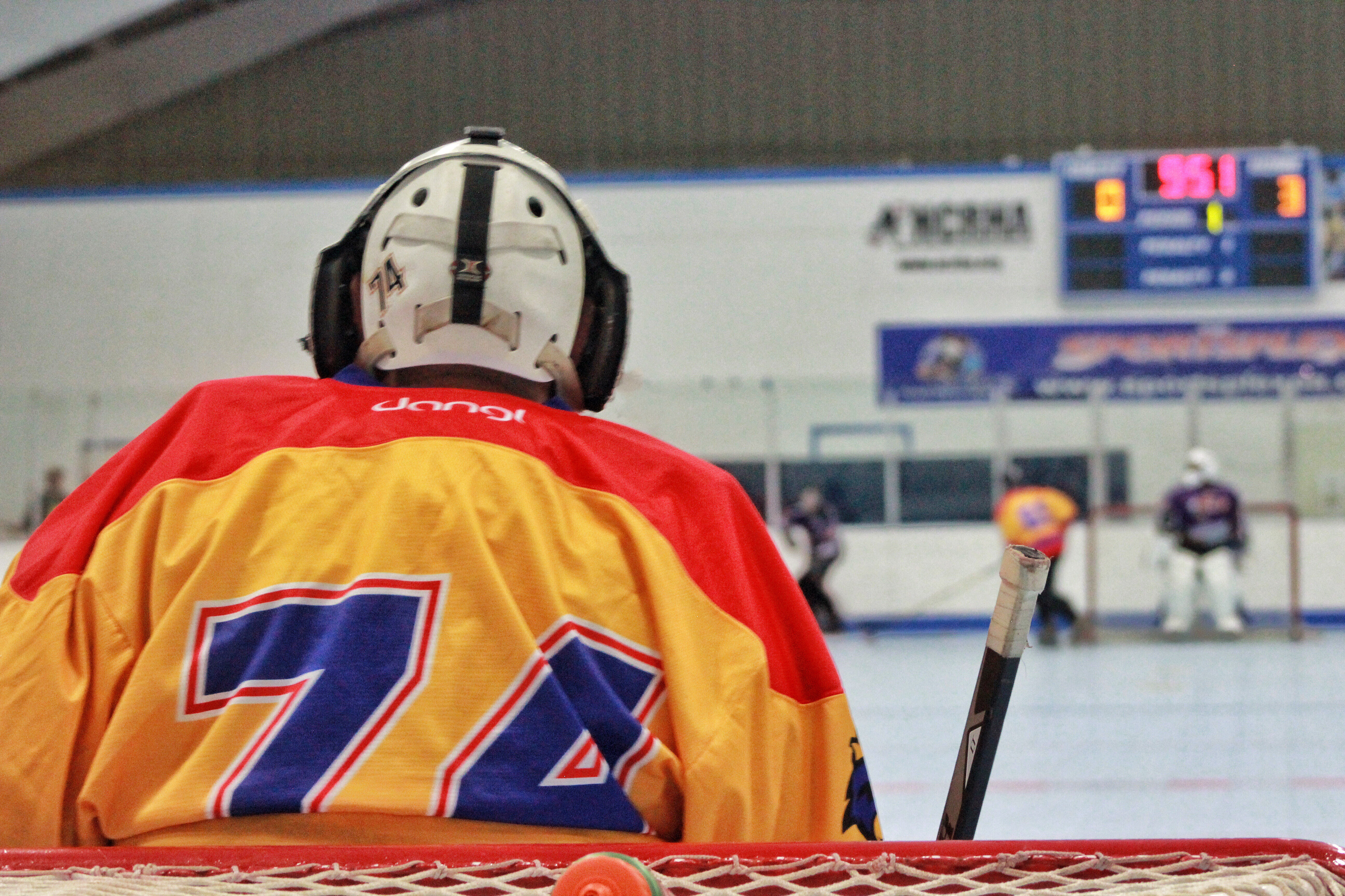
Jerseys in-game
Additional Custom Branded Products
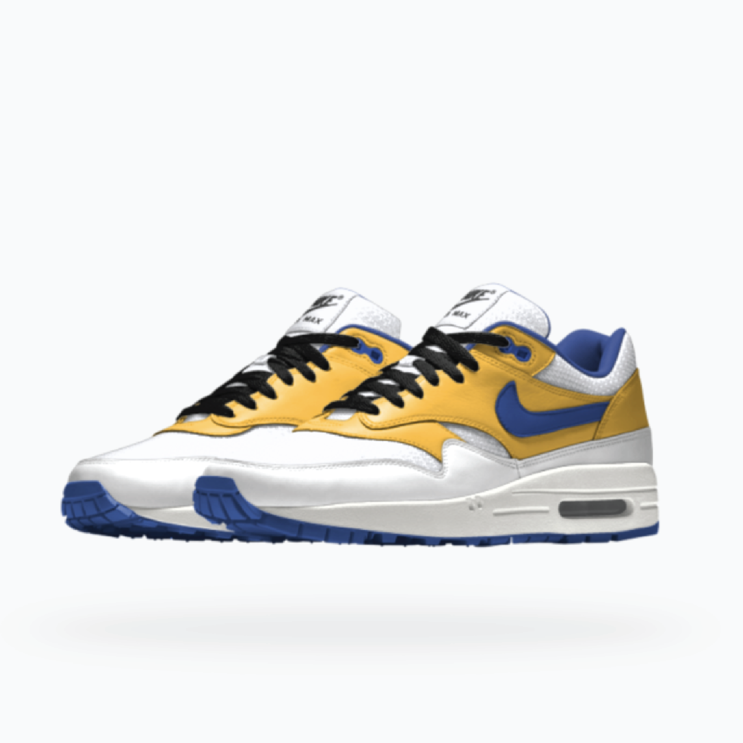
Custom Nike Air Max 1
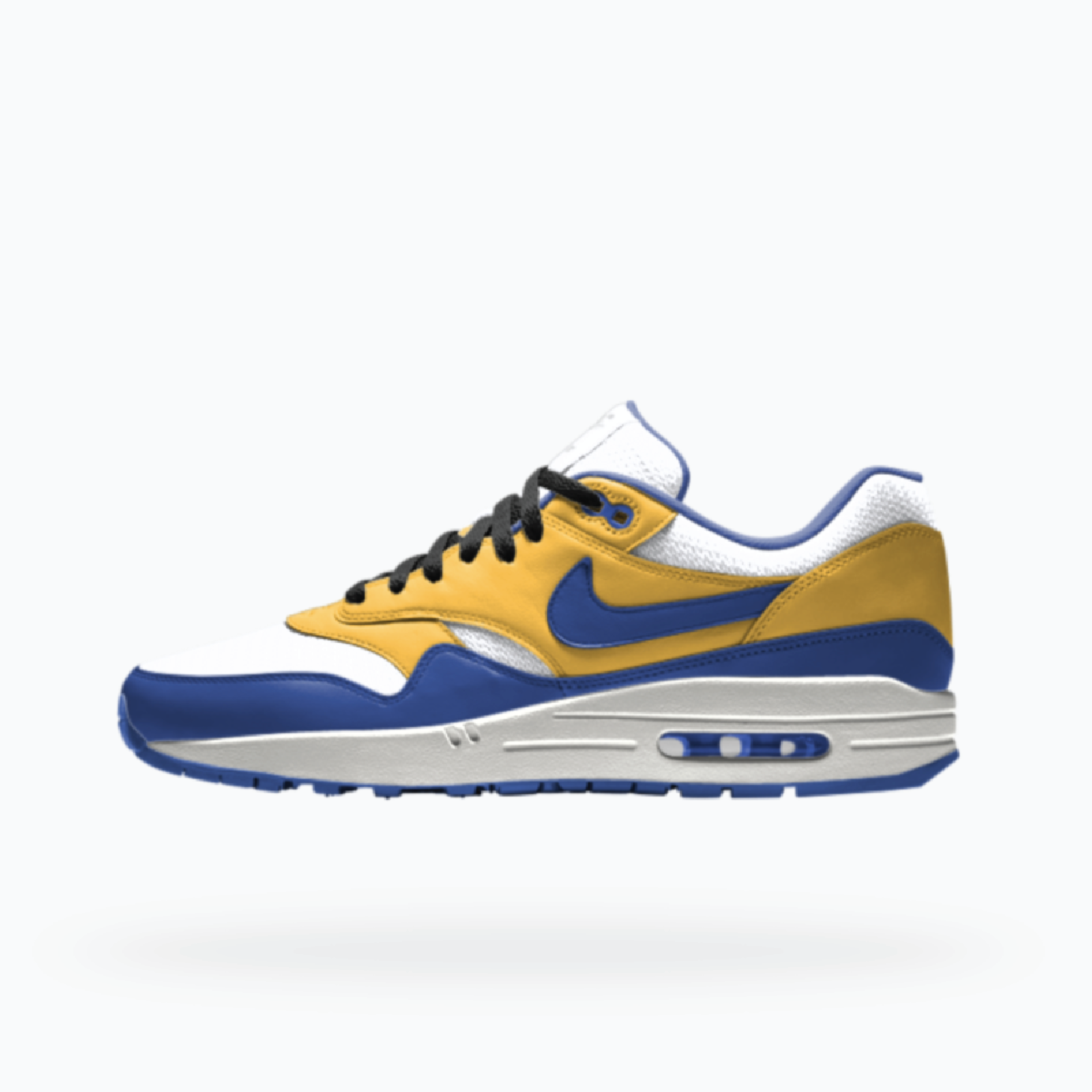
Custom Nike Air Max 1
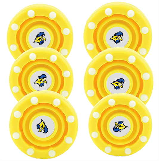
Custom puck stickers
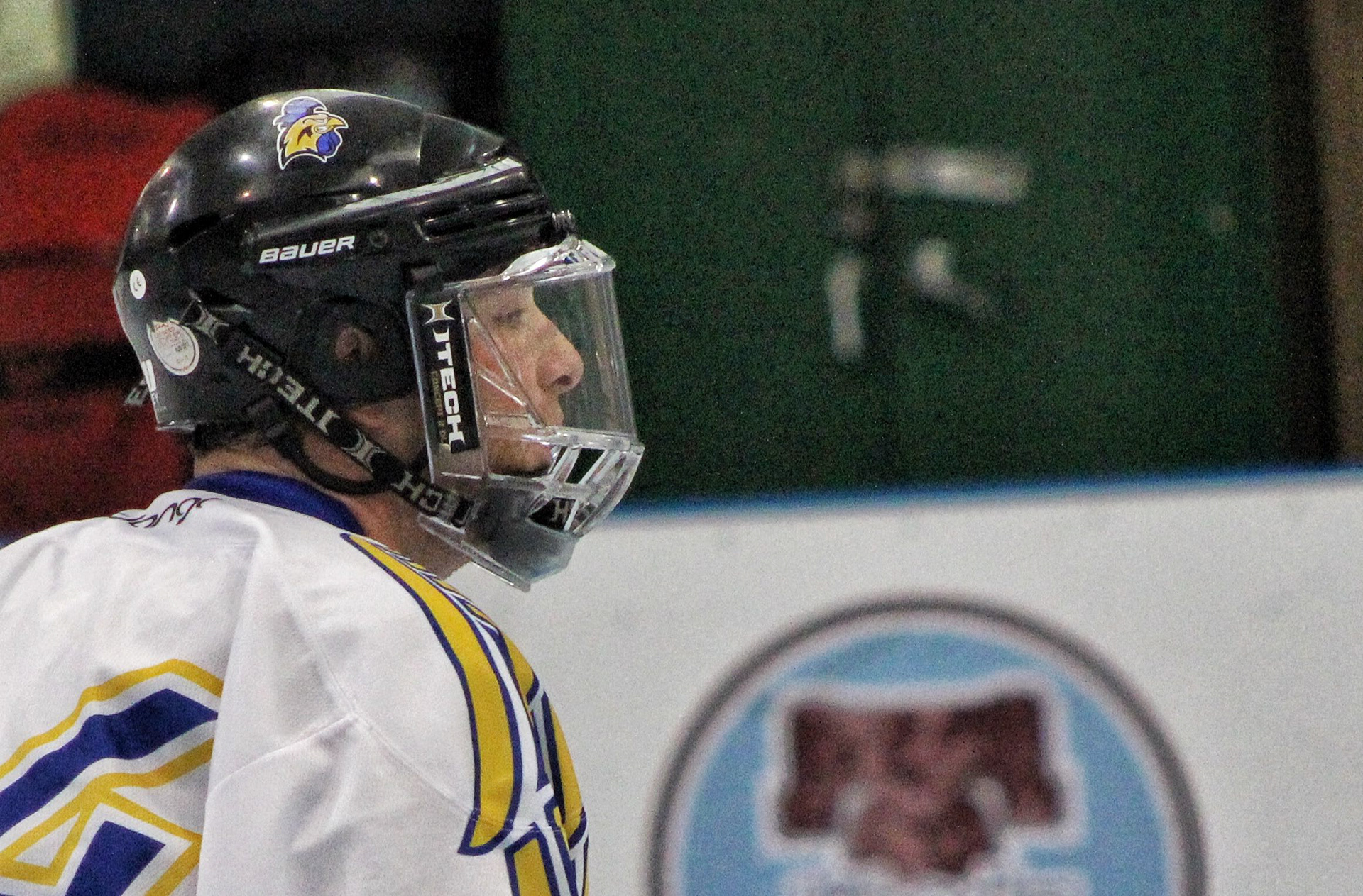
Helmet decals
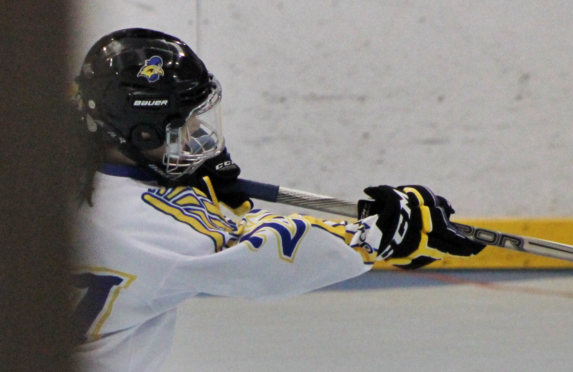
Helmet decals
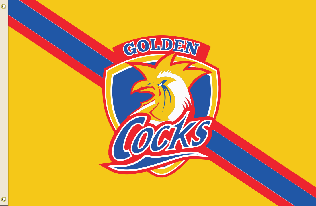
Locker room flag
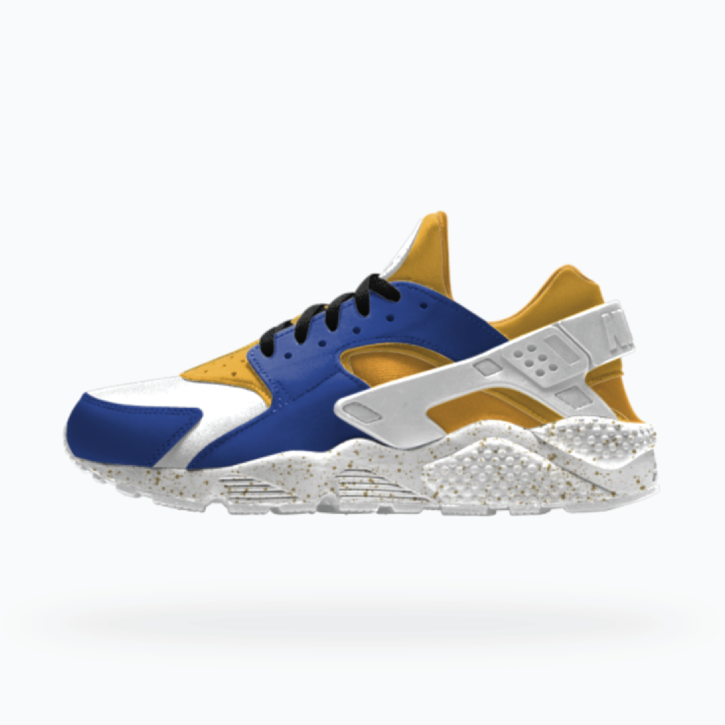
Custom Nike Huarache
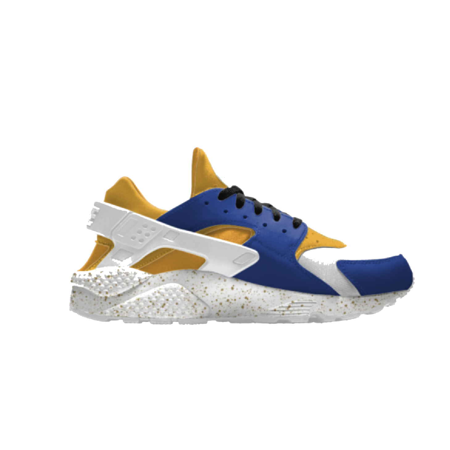
Custom Nike Huarache
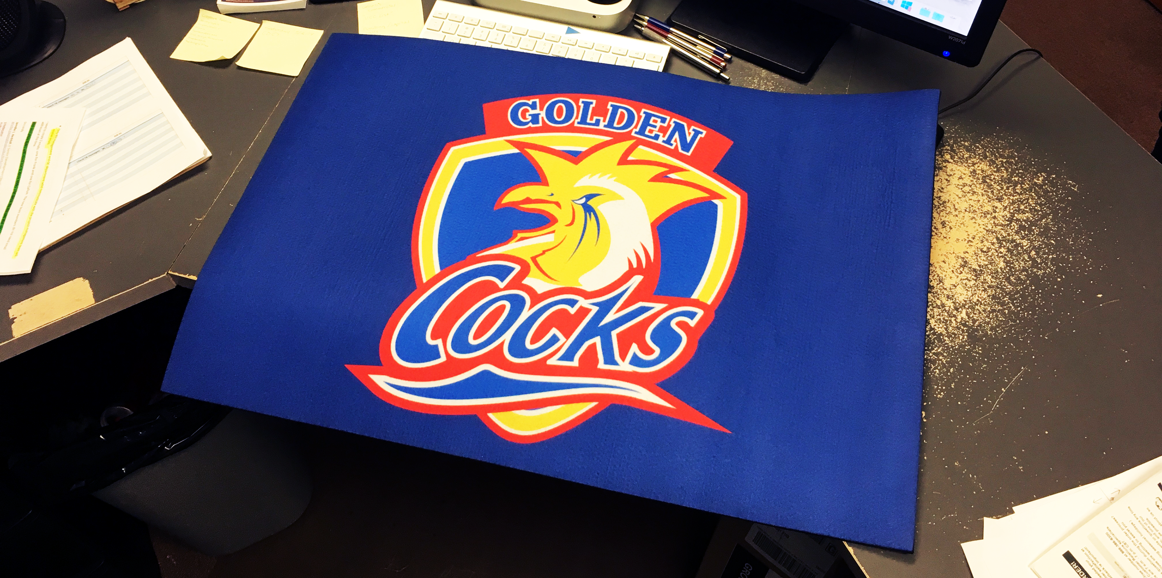
Locker room doormat
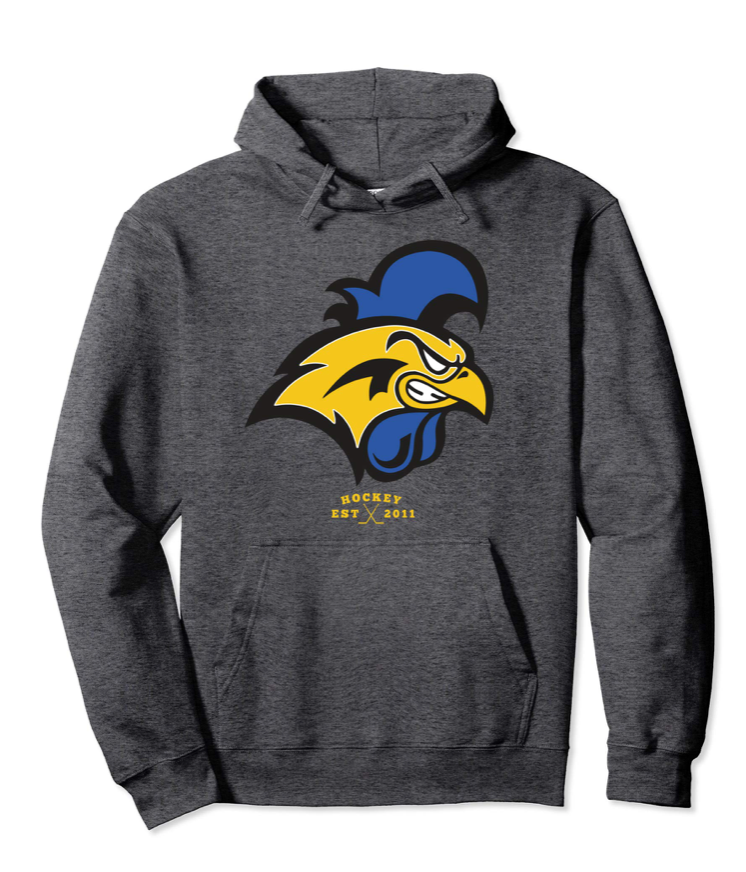
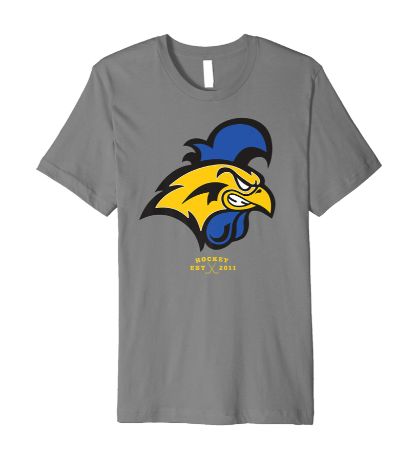
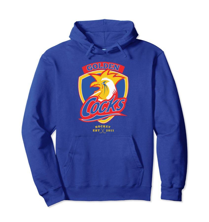
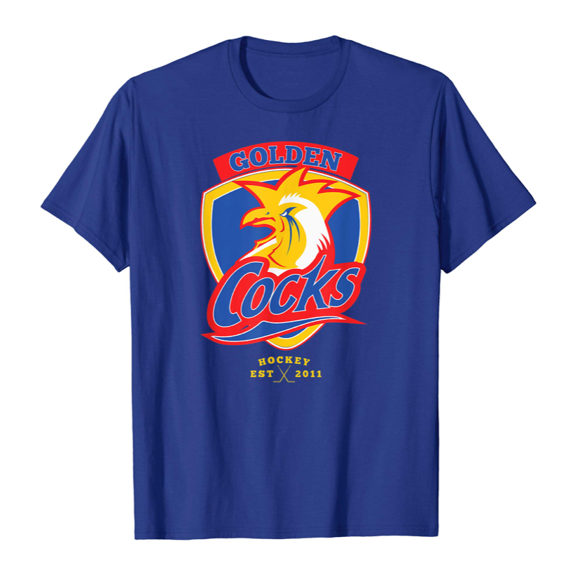
Print-on-Demand Team Merchandise
